The Brief:
To extend the visual identity of Space Machines Company through large-format, abstract visual works that express the beauty, tension, and physics of space. These works were commissioned to feature as immersive 3x3m prints at IAC 2025, serving as both brand extensions and conversation starters.
Creative Challenge
Frame the tension between art and science, abstraction and precision.
How can the unseen forces of space—like gravity, orbital inertia, and electromagnetic fields—be made visual in a way that feels emotionally resonant, scientifically grounded, and brand-aligned?
Final Outcome
Two large-scale artworks were printed at 3x3m and installed at the Space Machines Company booth at IAC 2025. The final works functioned as:
Ambient brand backdrops
Conceptual anchors for company storytelling
Quiet spatial disruptions within a busy exhibition floor
Collaborating closely with the founders, I played a key role in bringing this brand to life. From initial concept pitches to the development of the final logo and style guide, every aspect was crafted with attention to detail. Partnering with a Webflow developer, we created a stunning responsive one-page website that seamlessly integrates video, Lottie animations, and vector illustrations, ensuring an engaging user experience. The result is a dynamic online presence that truly reflects the essence of the brand.
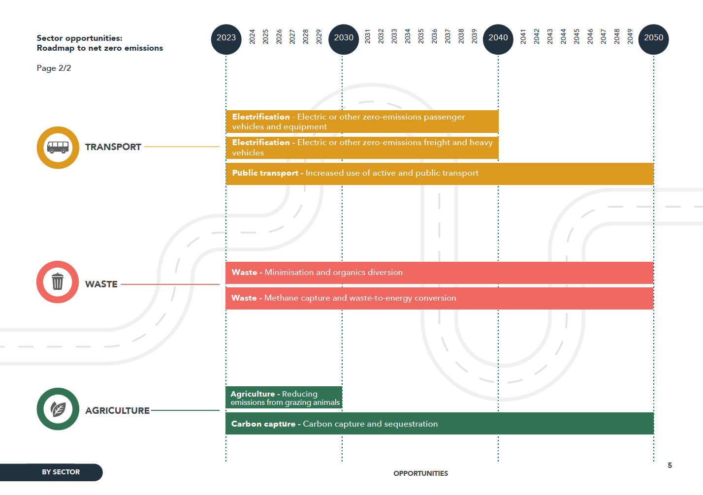
Challenge: To design a brand for the Food Agility CRC - a $250m collaborative research organisation. To represent their vision for the future of food, incorporating the impacts of digital and technological transformation. Their current logo conveyed agriculture and food missing the innovation or technology parts of the group. It also needed to be used by partners who needed clear guidelines on how it was to be used.
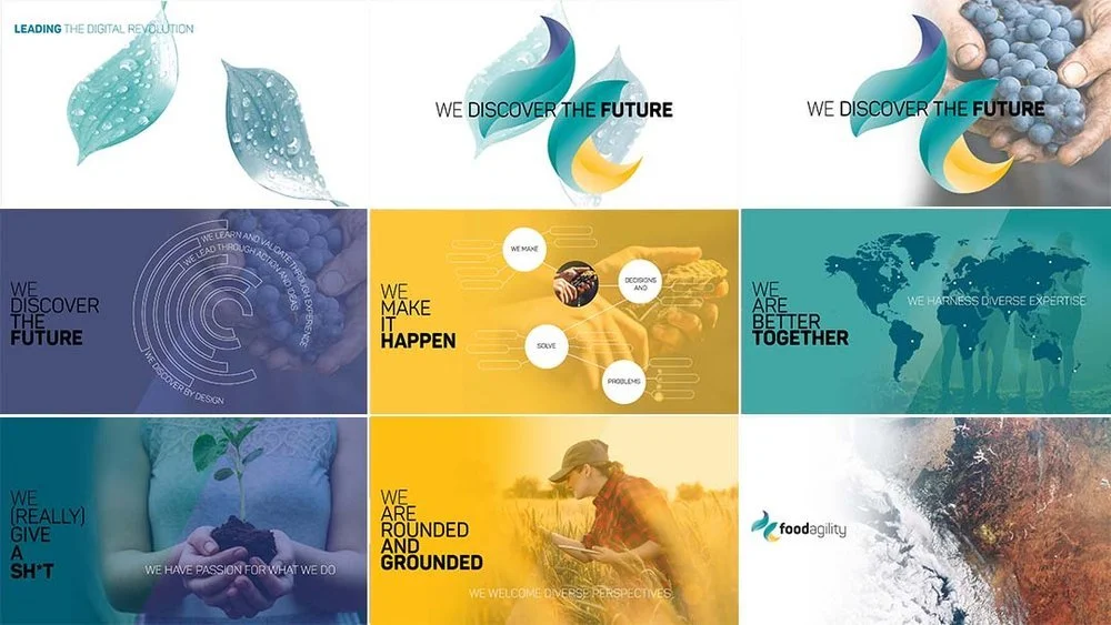
Solution: I initially focused on representing one aspect of each area; food, agriculture, the future of food, technology, and digital, and also the act of what they do as a group, bringing people together to make and transform ideas for the future of food. From there I hybridized these ideas eg food + digital, nature + transformation, to uncover the best way of describing the concept.
Outcome: A logo process that uncovered the most important quality of the group; 'agility'. It inspires it’s employees and stands out in the marketplace. A list of deliverables is expanded upon.
From The Food Agility’s newsletter:
We commissioned art director Karen Lee to create a brand identity that conveyed transformation, agility, nature and collaboration. We think she nailed it. We see the two leaves as representing the synergy between our commercial and research agendas.”
—————————————————————————————————
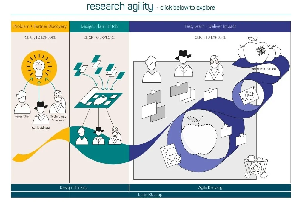
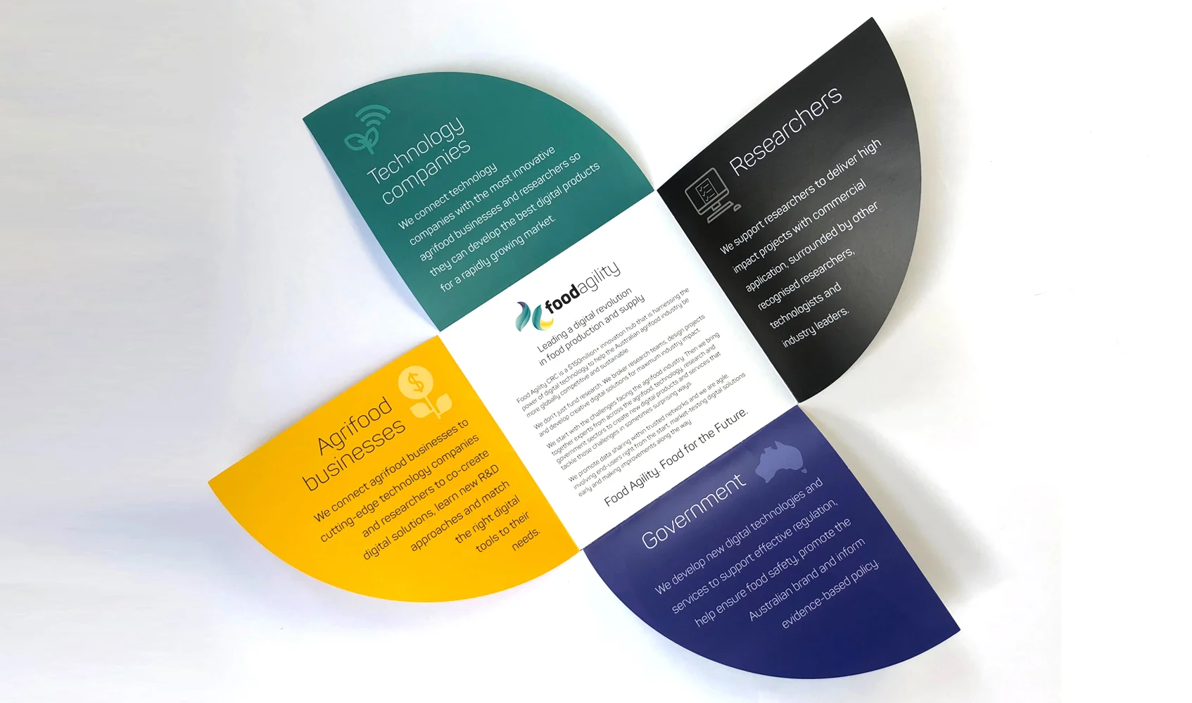
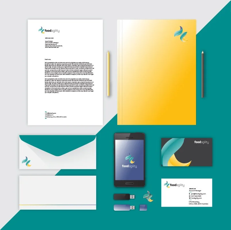
The branding work included:
Logo set for agencies and departments
Branding Guidelines
Annual Reports
Website Art Direction and Design
Banners and Media Wall Banners
Brochures
Slide and Presentation templates
Business Cards and Letterheads
Magazine Advertisements
—————————————————
Designed using Canva, style frames and motion design for a set of instore video screens.
Designed a 6–8 page summary information system (including a key infographic) that distilled a 108-page Net Zero Emissions Roadmap into a clear, scannable pdf for an interested, non-technical audience.
The brochure stays visually linked to the full report, while making the roadmap easy to grasp at a glance. The main infographic combines a timeline, six sectors, and their key opportunities/actions to reduce emissions, supported by a simple icon/graphic system for fast reading.
Designed a suite of four NSW Government–branded A4 fact-sheet brochures on Kangaroo Management in NSW (each 4 pages, portrait), covering: why kangaroos are managed, how populations are estimated (survey and counting methods), how quotas are set (using survey results, sustainability thresholds, and climate impacts), and what humane harvesting involves.
I created a cohesive visual system for the series—colour palette, typography/fonts, grid and layout rules, iconography and illustrative style—then applied it consistently across all pages. I also produced four custom infographics per fact sheet to translate complex content into clear, public-facing visuals. Deliverables were supplied as print-ready and web-ready accessible PDFs, with QR codes on each sheet, meeting NSW Government branding guidelines and PDF accessibility requirements.
I led the UI/UX design for the website redesign, ensuring cross-platform functionality and a cohesive user experience. Working closely with the Head of Marketing Communications, and strategy, content teams, we built the site with WebFlow developers. I also art directed a set of still-life photographs for the site.
The redesign of the Food Agility website aimed to showcase and capture the crisp, freshness of food and to focus on what this CRC is all about, bringing together agrifood farmers, technologists and researchers for the future of food in Australia.
www.foodagility.com
A pictographic design for branding CSIRO’s space agency platform. CSIRO is an Australian Government agency responsible for scientific research and works with leading organisations around the world.
Challenge: Create a cross over infographic style illustration that would appear as a signature graphic for the new space agency platform on all of CSIRO’s branding materials.
Deliverables: Concept ideas and sketches, look and feel mood boards, final directions, final concept in Illustrator and photoshop file formats.
Role: Art Director, Illustrator
Isonormic
Logo Design development for a VR/AR immersive training company, that works with the latest technology and global 3D and2D experts to develop real tactile experiences. The logo needed to embody elements of Interactive, futuristic, AR/VR and immersive sight and sound.
A company that runs innovation programs for researchers, innovators and primary producers to discover new opportunities in Fisheries and related industries.
The brand and marketing materials were created in time for the launch at The Seafoods Directions Conference, Sydney.
Saber Astronautics, a company specializing in reducing the barriers in space flight, needed a complete redesign of their existing website.
Looking at a way to develop their brand story, I concentated on finding a way of expressing what they do in space is so relative to how it relates to aspects of what we are doing on Earth.